 |
||||||||
|
|
||||||||
| Fantasy Art Technique | ||||||||
|
Painting a Mermaid |
||||||||
|
Most of my fantasy work is approached
in a similar way. I've used the mermaid demonstration below
to provide a rough outline of the techniques I use. All of the paintings in the fantasy gallery have been created in water-colour with the occasional use of small quantities of gouache &/or acrylic. Although water-colour is not the easiest medium to control it is the one that I am most familiar with and find most adaptable. |
||||||||
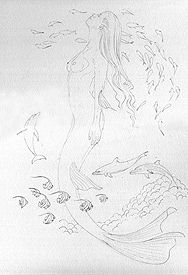 STAGE
1 For me, the the most important stage in developing a painting,
especially a complicated painting, is detailed planning and
layout. Before I launch into a painting, I like to have a
reasonable idea of what it is that I want to achieve. This stage
will include basic planning (detailed drawings and reference for
individual subjects/components, composition -making sure all the
elements of the painting fit together in harmony on the page)
and creative planning (establishing color themes and light
source - which direction the sun is shinning from, atmosphere
and treatment). For this painting I used Saunders Waterford paper, my usual choice. It is fairly robust and has an
interesting surface texture. STAGE
1 For me, the the most important stage in developing a painting,
especially a complicated painting, is detailed planning and
layout. Before I launch into a painting, I like to have a
reasonable idea of what it is that I want to achieve. This stage
will include basic planning (detailed drawings and reference for
individual subjects/components, composition -making sure all the
elements of the painting fit together in harmony on the page)
and creative planning (establishing color themes and light
source - which direction the sun is shinning from, atmosphere
and treatment). For this painting I used Saunders Waterford paper, my usual choice. It is fairly robust and has an
interesting surface texture. |
||||||||
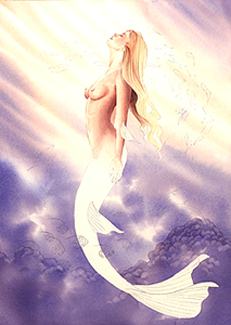 STAGE
2 First of all masking fluid was carefully painted over the
mermaid tail and left to dry. The initial background wash was
then applied using a mixture of French ultramarine, cobalt blue,
alizarin crimson and a weak mixture of cadmium orange and yellow
for the sun rays. Applying the initial wash involves wetting the
paper with clear water (I use a sponge or large brush) and then
adding pigment. This is called the wet in wet technique. The
intensity of the wash depends on the amount of pigment added. In
watercolour painting, colours are lightened by introducing more
water and darkened by adding more pigment. For me, the
application of the initial wash is probably the most
unpredictable and hazardous process in painting the picture.
This is partly because when laying in a large wash I have a
limited amount of control over what the paint will do when it
hits the paper, as well as a limited amount of time in which to
finish it (the whole wash must be completed before the paper is
dry otherwise unsightly runbacks or blooms may occur). Once the
wash was dry, the coral was suggested using a slightly more
concentrated mixture of the background colours alizarin crimson,
and the blues. STAGE
2 First of all masking fluid was carefully painted over the
mermaid tail and left to dry. The initial background wash was
then applied using a mixture of French ultramarine, cobalt blue,
alizarin crimson and a weak mixture of cadmium orange and yellow
for the sun rays. Applying the initial wash involves wetting the
paper with clear water (I use a sponge or large brush) and then
adding pigment. This is called the wet in wet technique. The
intensity of the wash depends on the amount of pigment added. In
watercolour painting, colours are lightened by introducing more
water and darkened by adding more pigment. For me, the
application of the initial wash is probably the most
unpredictable and hazardous process in painting the picture.
This is partly because when laying in a large wash I have a
limited amount of control over what the paint will do when it
hits the paper, as well as a limited amount of time in which to
finish it (the whole wash must be completed before the paper is
dry otherwise unsightly runbacks or blooms may occur). Once the
wash was dry, the coral was suggested using a slightly more
concentrated mixture of the background colours alizarin crimson,
and the blues. |
||||||||
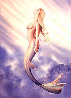 STAGE
3 Next the masking fluid was removed and the upper body and tail
were painted. When painting the Figure I prefer to start with
the most difficult aspect, usually the face. When painting the
skin tones it is important to consider the context in which the
figure appears. For instance in the mermaid painting I have
incorporated the background colours into the skin tone. This
helps to achieve unity in the painting and ensures that the
figure doesn't appear to be superimposed onto the background.
Developing the body form and creating depth, softness and
elasticity is a slow process and in this example took more than
ten washes and glazes of various intensity and colour. I start
of with washes of lighter tones and gradually build up the
darker areas. STAGE
3 Next the masking fluid was removed and the upper body and tail
were painted. When painting the Figure I prefer to start with
the most difficult aspect, usually the face. When painting the
skin tones it is important to consider the context in which the
figure appears. For instance in the mermaid painting I have
incorporated the background colours into the skin tone. This
helps to achieve unity in the painting and ensures that the
figure doesn't appear to be superimposed onto the background.
Developing the body form and creating depth, softness and
elasticity is a slow process and in this example took more than
ten washes and glazes of various intensity and colour. I start
of with washes of lighter tones and gradually build up the
darker areas. |
||||||||
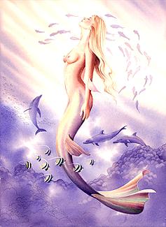 STAGE
4 To further enhance the illusion of depth, the (silhouetted)
arc of fish that circle the upper body, were suggested in
lighter tones and with limited detail. The Dolphins were then
painted using the same colour and intensity as was used for the
corral. The black and white stripped fish (Moorish Idol) in the
foreground were painted in more detail with a mixture of
Prussian blue and French ultramarine. The white stripes were
painted over the top of the initial water color wash with
gouache. STAGE
4 To further enhance the illusion of depth, the (silhouetted)
arc of fish that circle the upper body, were suggested in
lighter tones and with limited detail. The Dolphins were then
painted using the same colour and intensity as was used for the
corral. The black and white stripped fish (Moorish Idol) in the
foreground were painted in more detail with a mixture of
Prussian blue and French ultramarine. The white stripes were
painted over the top of the initial water color wash with
gouache.
|
||||||||
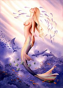 STAGE
5 A stronger mixture of colour was added to the coral in the
bottom left corner. As I didn't want to distract from the
mermaid I kept detail to a minimum. In general, strong
foreground tones help achieve a sense of recession and frame the
focal point. Finally the small orange fish were rendered in
gouache with a mixture of cadmium yellow, red and white. STAGE
5 A stronger mixture of colour was added to the coral in the
bottom left corner. As I didn't want to distract from the
mermaid I kept detail to a minimum. In general, strong
foreground tones help achieve a sense of recession and frame the
focal point. Finally the small orange fish were rendered in
gouache with a mixture of cadmium yellow, red and white. When I have finished a painting I put it away and come back to it a day or so latter with a fresh eye. I then seem to automatically focus on what I think that I could have done better. A painting seldom turns out the way I imagined it would. 'Happy mistakes' and the spontaneity of art and watercolour painting in particular can make results unpredictable but can also give a piece character and sparkle - you never quit know what you're going to get and I think this is one of the beauties of painting. In this watercolour I feel that the figure lacks the fluidity and sense of motion that I originally intended. Having said that I still think it works and I am pleased with the painting. |
||||||||
|
All images at this site are
copyrighted and are the specific property of Scot Howden.
Removal or reproduction in any form without permission is
infringement of the copyright law. © 2008 contact scot@barnstudio.com |